Denver Botanic Gardens
branding & annual report
This is a two-part project that focused on the redesign of the existing brandmark for Denver Botanic Gardens, as well as the design of a simplified version of the company’s annual report.
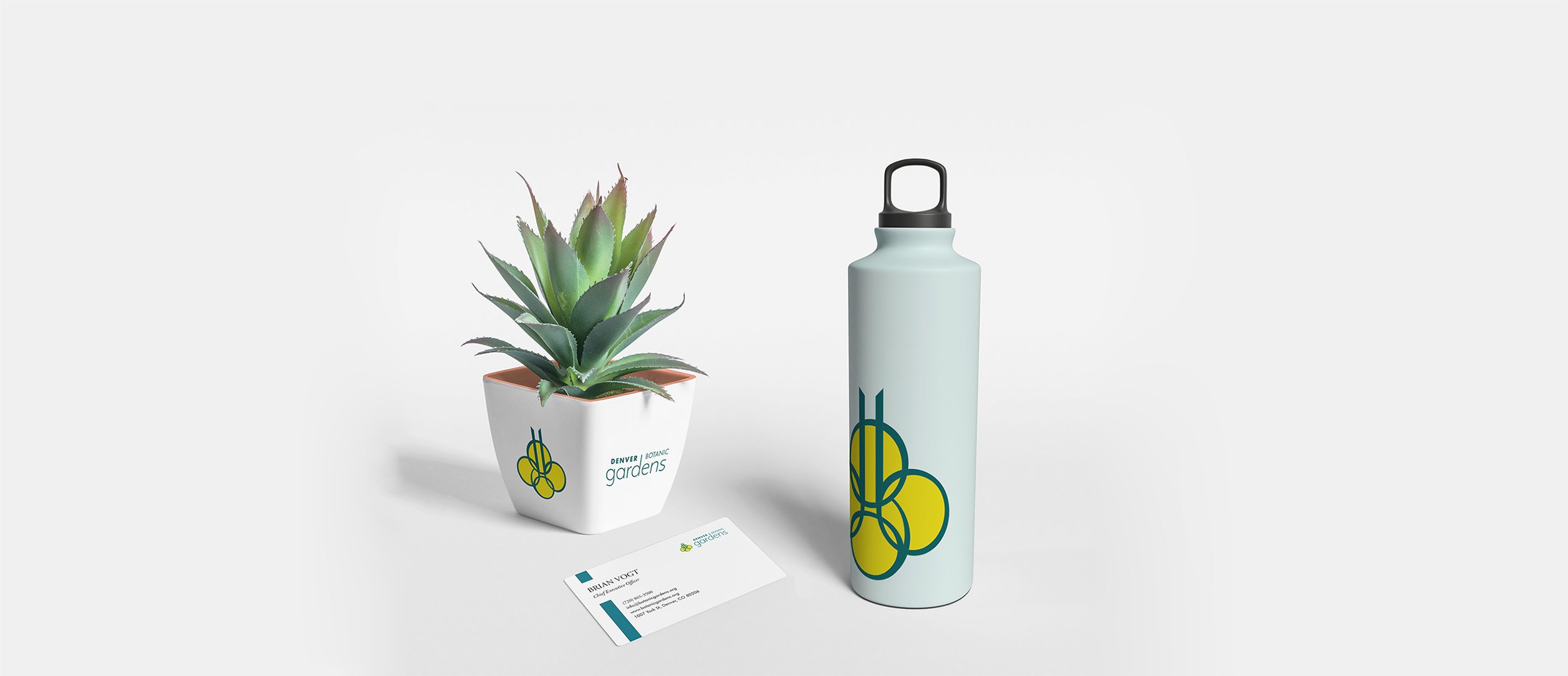
A pictorial component of the redesigned brandmark uses custom letters specifically designed for this project. Their visual Gothic architectural characteristics allowed for creation of a compelling final icon that has multiple interpretations: the elongated ascenders of “d” and “b” resemble a vine’s support structure, while the letters’ overlapping shapes create stained-glass appearance; and the overall outline of the logo reminds of the shape of a bee. Those references actively support the nature of a botanical garden. The turquoise and yellow color scheme adds to the essence of nature, while elevating the brand beyond the use of more traditional green and brown tones.

ORIGINAL DESIGN


The annual report uses information from the company’s existing report and utilizes the new brand guidelines. The final report contains original infographics as well as redesigned financial tables. The report’s color scheme is limited to just a few colors, including the ones from the brandmark. I aimed for this publication to be less text-heavy, reading more like a magazine rather than a book. This is why the layout contains a large number of photographs and graphic elements.


